
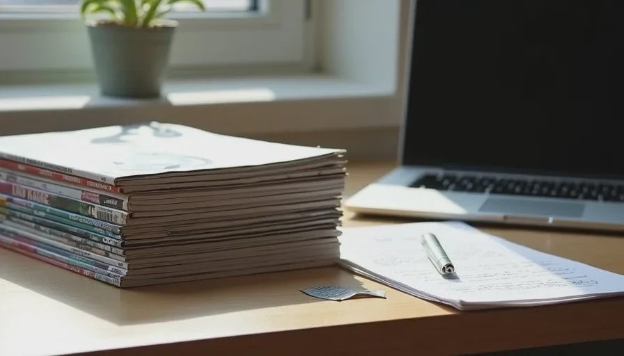
I keep a small stack of independent magazines near my desk. Not as decoration. As working references. When AI-generated visuals start to feel polished but directionless, I open one of them and look for the decisions that still feel sharper on paper than in most model outputs.
Independent magazines are useful for this purpose because they are forced to make choices under real constraints. Page count is limited. Budgets are limited. The work has to hold up across a sequence, not just in a single heroic frame. Those constraints produce a density of art direction decisions that AI systems rarely invent on their own.
This is not a reading list for nostalgia. It is a practical account of what I take from specific kinds of independent magazines and how those lessons change the way I direct AI image work.
Why Print Still Functions as a Corrective
AI image generation optimizes for the single frame. Even when multiple images are produced, each one is usually evaluated in isolation. Magazines are sequences. The meaning of any single page depends on what comes before and after it. That sequential pressure forces clearer hierarchy, more deliberate pacing, and a stronger sense of what can be left quiet.
Print also makes production decisions visible. Paper stock, ink behavior, trim size, and binding all leave traces. These traces are not always beautiful. They are almost always specific. AI imagery, by contrast, defaults toward frictionless surfaces and idealized lighting unless it is actively prevented from doing so.
When I am directing AI visuals for brand systems, editorial concepts, or content series, I use magazines as a reminder of what considered visual work looks like when it has to survive physical reality and repeated viewing.
What I Look For When I Open a Magazine
I do not study magazines for style to copy. I study them for decision patterns.
How is hierarchy established without relying only on scale?
Where does the eye enter the spread, and what is allowed to remain secondary?
How much visual noise is tolerated, and where is restraint applied?
How are typography, photography, and empty space made to work as a single system rather than as competing elements?
What kind of image is allowed to be quiet, and what kind is required to carry the page?
These questions transfer directly to AI art direction. Most generated images fail not because they are poorly rendered, but because the underlying decisions about hierarchy, pacing, and emphasis were never clearly made.
Magazines That Function as Working Tools
I return to several kinds of independent magazines for different reasons.
Design and visual culture magazines are useful for studying how contemporary art direction solves problems of density and clarity on the page. I pay attention to how they handle cover lines, how they sequence long features, and how they let certain images breathe while others are tightly controlled.
Photography-driven independent titles are useful for studying editing. The choice of which frame follows another, how much white space surrounds an image, and when a photograph is allowed to sit without explanation all demonstrate a form of judgment that AI generation still lacks. Generation produces options. Editing decides.
Smaller, more idiosyncratic magazines—often from specific cities or scenes—are useful for studying specificity. Their visual language is usually less polished and more particular. Local references, unorthodox croppings, and production quirks appear because the makers are working close to a real context. That closeness is harder to simulate in a prompt.
I do not need the magazines to be current. Older issues often contain clearer examples of decisive art direction precisely because they were made under tighter constraints.
Translating Magazine Lessons Into AI Direction
The transfer from print to AI work happens through constraints and review standards, not through stylistic imitation.
Before generating, I sometimes write a short note derived from a magazine observation: “Hierarchy must work without relying on extreme scale contrast.” Or: “Allow one element to remain unresolved so the frame does not feel fully explained.” These notes become part of the direction brief.
During review I place generated images next to magazine spreads that solved similar problems. The comparison is rarely about matching a look. It is about checking whether the generated work has made decisions of comparable clarity. If the magazine spread feels more intentional, the AI work usually still needs tighter direction.
I also use magazines to calibrate my tolerance for polish. Many AI images look expensive and still feel empty. Many magazine pages look less refined and still feel complete. The difference is usually in the quality of the decisions, not in the level of finish.

Specific Lessons That Recur
Several lessons appear across the magazines I use most.
Restraint is a form of emphasis. Pages that refuse to fill every available area often feel more deliberate than pages that demonstrate maximum capability. AI systems tend toward demonstration. Human direction has to introduce the possibility of less.
Sequencing creates meaning that single frames cannot. Even when the final deliverable is a single image, thinking in terms of sequence—what would come before this frame, what would come after—improves the decisions inside it.
Typography and image must be designed as one system. Magazines that treat type as an afterthought or as pure decoration usually feel weaker. The same is true of AI visuals that generate strong imagery and then drop generic type on top.
Specificity compounds. A single particular detail—a certain quality of light, a real material, an unorthodox but motivated crop—can make an entire frame feel considered. Magazines that sustain specificity across many pages set a higher standard for what “detailed” actually means.
Building a Personal Reference Practice
I do not collect magazines systematically. I keep the ones that continue to teach me something after multiple viewings. A title earns its place on the shelf by remaining useful under repeated attention.
When I find a spread that solves a problem I am currently facing in AI work, I document the decision rather than the aesthetic. “This page establishes hierarchy through weight and placement rather than size.” “This sequence uses a quiet frame to reset attention after three dense ones.” These notes are more portable than tear sheets.
I also notice which magazines begin to feel less useful over time. When a title starts repeating the same solutions, or when its art direction becomes primarily atmospheric rather than structural, I stop treating it as an active reference. The goal is not a permanent library. The goal is a living set of standards.
What Magazines Cannot Teach
Independent magazines are not a complete education in art direction. They do not teach how to prompt. They do not teach model-specific technical control. They do not replace the need to understand the strategic job an image has to perform.
Their value is corrective. They raise the standard for what counts as a finished visual decision. They make the average output of image models look more clearly average. They remind the person directing the work that polish and intention are not the same thing.
Used this way, magazines function less as inspiration and more as calibration tools. Inspiration is easy to find. Calibration is rarer and more useful.
Integrating the Practice Into Regular Work
I do not open a magazine before every generation session. I return to them when the work starts to feel stuck in familiar solutions, or when a series of AI outputs looks competent and still fails to satisfy. The magazines provide a way to step outside the feedback loop of the model and re-enter with sharper criteria.
Over time the practice changes what I ask for in prompts and what I accept in review. Requests become more precise. Rejection becomes faster and less emotional. The images that survive feel less like products of the tool and more like products of a directed process.
This is the practical benefit. Not better taste for its own sake, but better standards for deciding when visual work is actually doing its job.
Closing Note
AI image tools will keep improving at rendering, consistency, and control. The ability to direct those tools toward specific, intentional results will still depend on the quality of the visual judgment brought to the process. Independent magazines remain one of the more efficient ways I know to keep that judgment sharp.
They are physical, sequential, constrained, and made by people who had to commit to their choices. Those conditions produce lessons that still transfer. The next time an AI image looks finished and still feels incomplete, try opening a magazine that you trust and looking for the decisions that the generated frame has not yet made. The gap is usually easier to see on paper.
Travellers Write
No letters yet — be the first traveller to write.