
I stop in front of the same kinds of storefronts more often than is reasonable. Hand-painted signs with letters that are slightly uneven. Windows layered with old posters, sun-faded notices, and the occasional handwritten note. Brick that has been painted and scraped and painted again. Metal shutters with residual graffiti ghosting through the newest coat of paint. None of it is designed for a photograph. All of it is specific.
When I work with AI image models on brand or editorial visuals, these storefronts have become one of my most reliable references. Not because I want the outputs to look like Brooklyn shopfronts, but because the storefronts demonstrate qualities that models still under-produce unless they are deliberately directed: accumulated detail, imperfect light, material history, and the visual evidence of decisions made over time rather than in a single generation pass.
This is not a romantic argument about authenticity. It is a practical one about specificity. Generic AI imagery often fails not because it is poorly rendered, but because it lacks the density of particular choices that real environments display without effort. A good storefront is a compact lesson in those choices.
What the Storefront Actually Contains
A single well-observed shopfront holds more usable visual information than most mood boards.
The lettering alone is rarely perfect. Hand-painted signs show pressure changes in the brush, slight variations in character width, and the occasional correction. Vinyl letters peel at the corners. Neon tubes are sometimes partially out. These imperfections are not stylistic flourishes. They are the residue of production methods, budgets, weather, and time.
The window is rarely a clean display. Real merchandise sits at slightly inconsistent depths. Price tags and small signs create secondary layers of information. Reflections mix the interior with the street. Dust, tape residue, and the occasional sticker add surface history that no one planned as a design element.
The surrounding architecture contributes further constraints. The sign has to work with the available facade. The proportions are given, not chosen in a vacuum. Adjacent buildings, pipes, security gates, and sidewalk infrastructure all remain visible. The frame is shared with the city.
Light is specific to time and orientation. Morning light on a north-facing window is different from late afternoon light on a west-facing one. Seasonal changes matter. The same storefront in flat midday light and in low golden light reads as two different visual problems.
None of these qualities are exotic. They are ordinary. Their ordinariness is exactly why they are useful as a corrective to AI defaults.
What Models Tend to Smooth Away
When image models generate commercial or brand imagery without strong direction, they reliably prefer certain solutions.
Surfaces tend toward the clean and the newly made. Material history is minimized. Wear appears, if at all, as a controlled aesthetic effect rather than as evidence of use.
Lettering tends toward the balanced and the well-kerned. The slight awkwardness of real hand-painted or hastily applied type is treated as an error to be corrected.
Environments tend toward the uncluttered. Visual noise is reduced. Secondary information is removed so that the primary subject can dominate without competition.
Light tends toward the flattering and the controllable. The complicated mixtures of fluorescent, daylight, and reflection that characterize real shop windows are simplified into more legible, more beautiful illumination.
These tendencies produce images that are easy to like and hard to remember. They also produce images that are difficult to connect to any particular place, history, or set of real constraints. The storefront offers a standing reminder of what is being left out.
Using the Storefront as a Direction Tool
I do not feed photographs of Brooklyn storefronts into models and ask for imitations. That approach usually produces pastiche. Instead I use the storefronts to sharpen the questions I ask before and during generation.
What kind of surface history belongs in this image?
How much secondary information should remain visible?
What quality of light is accurate to the world this brand or story inhabits?
Where should the lettering or typography feel considered, and where should it feel expedient?
What elements should look like they pre-existed the frame rather than being generated for it?
These questions are more useful than requests for “authentic,” “raw,” or “documentary” aesthetics. Those adjectives are too broad. The storefront supplies concrete standards against which generated options can be judged.
When reviewing AI output, I sometimes place a real storefront photograph beside the generated frames. The comparison is rarely flattering to the model, but it is clarifying. The generated image may be more polished. The photograph almost always contains more particular decisions per square inch.

Specificity Is a Density of Decisions
The most useful lesson the storefront offers is that specificity is not a style. It is a density of accumulated decisions, many of them small and none of them made for the camera.
A model can approximate the look of accumulation. It cannot originate the chain of real-world causes that produce it. That limitation is not a failure of the technology. It is a reminder of where human direction still has to supply what the system cannot invent.
When brand or editorial work needs to feel grounded, the direction process has to import constraints that resemble the ones the storefront already has: limited budgets, existing architecture, weather, use, and the passage of time. These constraints can be simulated in prompting and reference, but only if the person directing the work has first paid attention to how they operate in reality.
Walking and looking remains one of the cheapest ways to maintain that attention. The camera is optional. The noticing is not.
Practical Applications in AI Visual Work
The storefront lesson translates into several working habits.
Before generating, I write a short list of material and environmental constraints that should remain visible in the final image. These are not mood words. They are physical conditions: mixed light sources, surface wear of a particular kind, secondary signage, imperfect alignment.
During generation I request variations that deliberately retain visual noise rather than eliminating it. Clean versions are easy to produce later if needed. Versions that start clean rarely regain meaningful complexity.
In review I treat excessive polish as a potential warning sign rather than as an automatic success. If the image looks resolved in a way that no real environment ever is, I ask what has been removed and whether that removal serves the work.
I also keep a small personal library of storefront details—lettering, window layers, material junctions, light conditions—not as images to copy, but as calibration tools. When AI output begins to feel generically refined, the library provides a quick way to reset the standard.
What This Does Not Mean
It does not mean every AI image should look weathered or urban. Many brands and stories require clean, controlled, or idealized visuals. The storefront is not a universal aesthetic.
It means that even clean work benefits from the discipline of specificity. A minimal interior can still contain particular material choices, particular light, and particular evidence of use or intention. The alternative is not always dirt or disorder. The alternative is often simply more precise decisions.
It also does not mean that AI is incapable of specific results. With strong references, tight constraints, and rigorous selection, models can produce highly particular images. The storefront simply makes visible how much direction is required to reach that level of particularity.
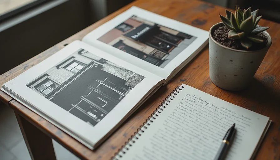
Building the Habit of Looking
The value of the storefront as a teacher depends on repeated attention. One walk produces a few observations. Regular walks produce a working sense of how real visual environments behave under different conditions.
I notice different things depending on the time of day, the season, and the errands I am running. Morning light on painted metal. The way rain darkens certain bricks and leaves others almost unchanged. The accumulation of small handwritten signs in a single window over several months. These details do not automatically transfer into better prompts. They improve the quality of the standards I bring to the work of directing and selecting.
Over time the habit changes what counts as a successful AI image. Technical quality becomes assumed. Specificity becomes the variable that matters. Images that once would have been accepted as strong enough now read as under-decided.
Closing the Loop
AI image models will continue to improve at rendering complex scenes, handling typography, and approximating material qualities. Some of the gaps that storefronts currently highlight will narrow. The underlying need for human observation will not disappear.
Someone still has to decide which qualities of the real world are relevant to a given piece of work. Someone still has to notice when the generated image has defaulted to a smoother, less particular version of those qualities. Someone still has to send the work back for another pass with tighter constraints.
The Brooklyn storefront is one available teacher. Any sufficiently complex real environment can serve a similar function. The requirement is only that we keep looking at things that were not made for the prompt window, and that we let what we see raise the standard for what we are willing to accept from the model.
Specificity is not a filter or a style strength. It is the visible result of many small, real decisions. AI can help express those decisions once they have been made. It cannot replace the looking that makes them possible in the first place.

Travellers Write
No letters yet — be the first traveller to write.