
I can usually tell within three seconds. The lighting is soft and expensive. The composition is balanced. The color grade feels contemporary. The product sits in a space that looks designed. And yet the image says almost nothing about the brand that commissioned it.
This is the problem with a large share of AI-generated brand photography. It looks finished. It looks costly. It also looks interchangeable. I have started calling it expensive wallpaper: high production value with low specificity.
The issue is not that the models are incapable of better work. The issue is that most prompts and review processes never demand the kind of visual decisions that create distinctiveness. The result is a growing library of images that feel premium and remain forgettable.
This article is about why that pattern keeps appearing and how I work against it when directing AI visual output for brands.
The Surface Qualities That Fool the Eye
AI image models have become very good at certain surface signals of quality.
They handle soft, directional light with ease. They produce clean product isolation and plausible material reflections. They generate interior spaces that feel styled rather than empty. They apply color grades that match current commercial trends.
These qualities used to require significant time, budget, and craft. Now they appear on demand. The speed is useful. It is also misleading. When the surface looks resolved, it becomes harder to notice that the underlying visual decisions are generic.
I see the same default patterns repeat across categories:
Neutral, lightly lived-in interiors that could belong to any quiet lifestyle brand
Soft daylight that never commits to a specific time or place
Props chosen for texture rather than for meaning
Compositions that prioritize balance over tension or hierarchy
The images are rarely ugly. They are rarely memorable either.
Why Specificity Is Harder Than Polish
Polish is a technical problem. Specificity is a strategic one.
To make an image specific, someone has to decide what the brand is willing to look like and what it is willing to reject. Those decisions require knowledge of the category, the audience, and the brand’s actual position. They also require the willingness to leave certain aesthetic options on the table.
AI will not make those decisions on its own. It will average toward the most common successful patterns in its training data. When the prompt is vague or when the review process only checks for “quality,” the model returns expensive wallpaper.
I have tested this repeatedly. Give the same product brief to a model with only aesthetic instructions and the output will look refined and rootless. Add precise constraints drawn from real references—specific materials, real locations, particular qualities of light, clear rejection criteria—and the results improve. The difference is never the model. The difference is the quality of direction.
Real References Outperform Aesthetic Adjectives
One of the most reliable ways I improve AI brand photography is to stop describing the desired mood in abstract terms and start anchoring the work in concrete references.
Instead of asking for “minimal, warm, elevated lifestyle,” I bring in specific material samples, film frames, storefront photographs, packaging details, and independent magazine spreads. These references give the model (and the human reviewer) something measurable to work against.
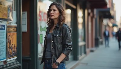
Brooklyn has become a practical reference library for me. Hand-painted signage, weathered materials, particular qualities of afternoon light on brick, the way objects sit in real independent shops—these details carry more useful information than most mood-board adjectives.
When I review AI output, I ask whether the image could only belong to this brand or whether it could be swapped into three competing decks without anyone noticing. If the answer is the second, the work is still wallpaper.

The Decisions That Create Visual Distinction
Specific brand photography usually rests on a small number of clear choices:
What kind of light actually belongs to this brand’s world?
What materials and surfaces should appear, and which should never appear?
How much lived-in evidence is allowed, and what kind?
Where should the eye go first, and what should remain secondary?
What emotional temperature is accurate rather than flattering?
These questions cannot be answered by generating more variations. They are answered by returning to the brand brief and to real visual evidence, then applying judgment.
I keep a short rejection list for every project. It names the visual defaults I will not accept, even if they look polished. Common entries include generic soft daylight, prop styling that signals “lifestyle” without meaning, and color grades that feel trendy rather than true to the product.
The list is not aesthetic snobbery. It is a practical tool for protecting specificity.
A Working Process for Better AI Brand Images
My current process for brand photography with AI follows a consistent sequence.
First, I clarify the visual non-negotiables from the brand brief and from real references. No generation happens until these are written down.
Second, I generate for range rather than for final frames. I ask for multiple interpretations of light, surface, and composition so I have material to judge.
Third, I review against the non-negotiables and the real references. Most of the output is discarded. The surviving directions are refined with tighter constraints.
Fourth, I test the strongest frames against the original strategic job of the image. Does it help the brand feel more distinct, or does it only make it look more produced?
This sequence is slower than prompting for a finished image. It produces work that is harder to confuse with everything else in the category.
What Changes When Specificity Becomes the Standard
When teams start measuring AI brand photography by specificity rather than by surface polish, several things shift.
They spend less time generating and more time deciding. They build tighter reference libraries drawn from the real world. They become more willing to reject fluent but generic output. They treat visual direction as part of brand strategy rather than as a downstream production task.
The images that result are rarely the most immediately “beautiful” ones the model can produce. They are the ones that could not be swapped into another brand’s work without losing meaning.
That is the standard I use now. Expensive wallpaper is easy to generate. Specific visual work still requires direction.

Practical Next Steps
If you are directing AI brand photography, try this on the next project:
Write the visual non-negotiables before any prompting begins. Collect three to five real references that already feel true to the brand. Generate more options than you need, then delete aggressively. Review every surviving frame against the original strategic job of the image, not just against aesthetic preference.
The models will keep improving at polish. The responsibility for specificity remains human. The brands that treat that responsibility seriously will be the ones whose images continue to mean something after the first glance.


Travellers Write
No letters yet — be the first traveller to write.